Ask in plain language
Describe the comparison, story, or interaction you need instead of hunting through a fixed chart library.
Build tailored visualizations inside Power BI using plain language. AI sees your schema—not your data—then your chart renders locally.
 AI Flex Chart
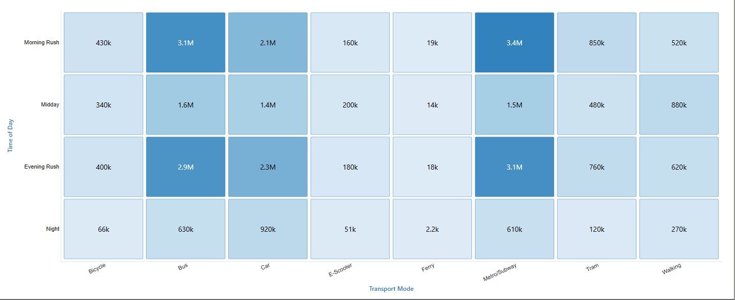
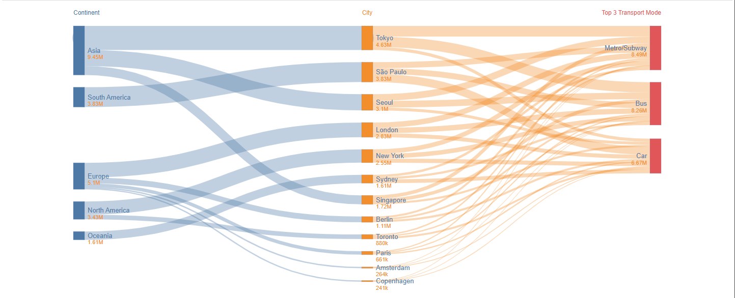
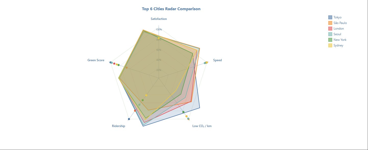

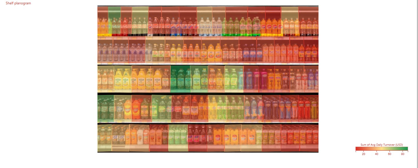
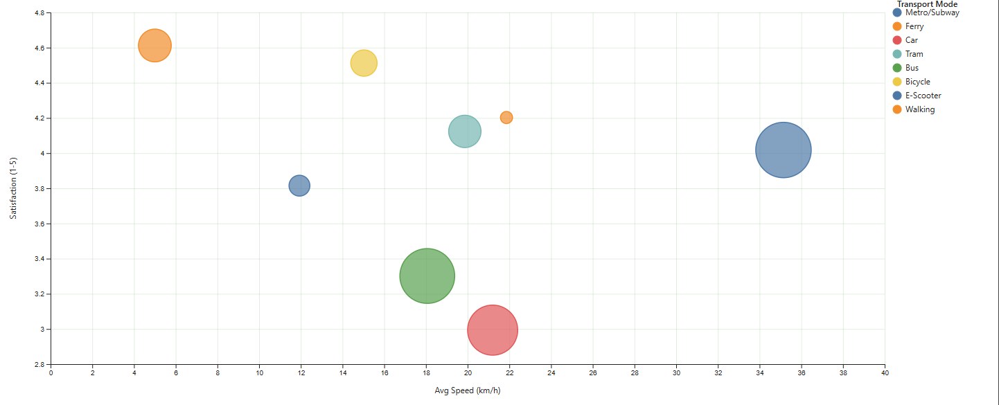
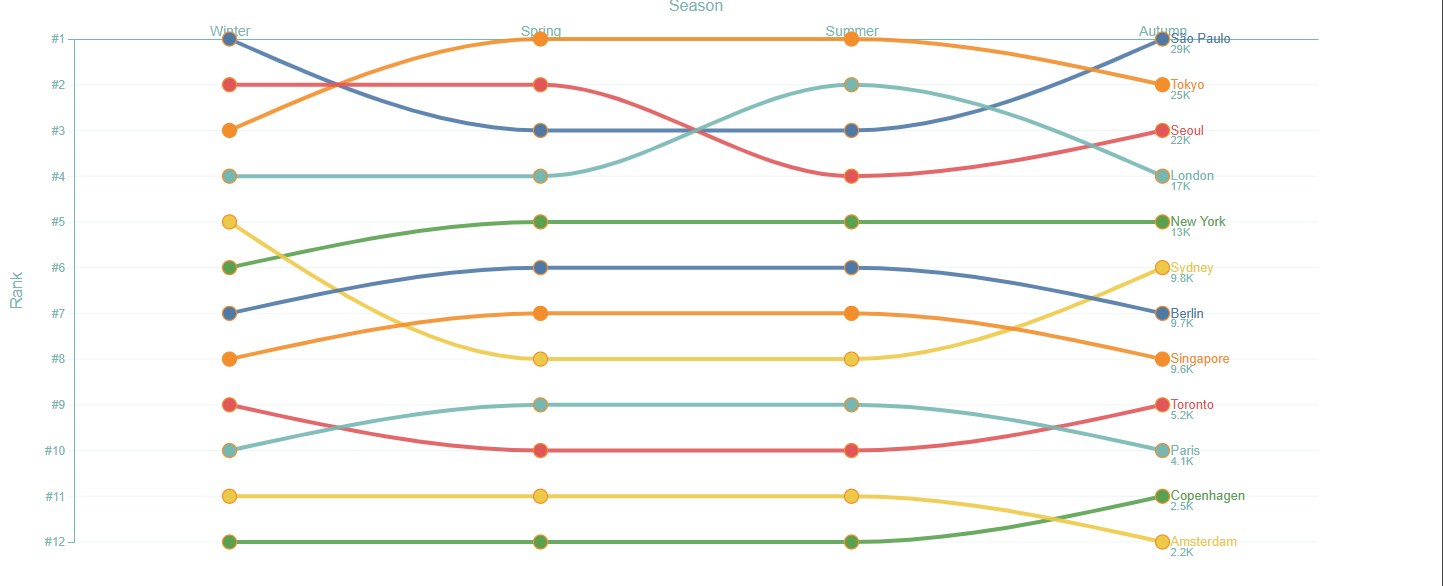
The AI writes the visualization logic. Power BI supplies the real values only when that code runs inside the visual.
Describe the comparison, story, or interaction you need instead of hunting through a fixed chart library.
Create purpose-built visuals shaped around your fields, business questions, and intended analysis.
Only field names, types, and row count reach the model. Customer records remain inside Power BI.